The Context
LSports is a leading global sports data technology provider that collects, processes, and distributes millions of real-time data points - live scores, odds, and statistics - to sportsbooks worldwide. In this high-velocity ecosystem, data anomalies are inevitable: an incorrectly recorded goal, a faulty odds ratio, a delayed settlement.
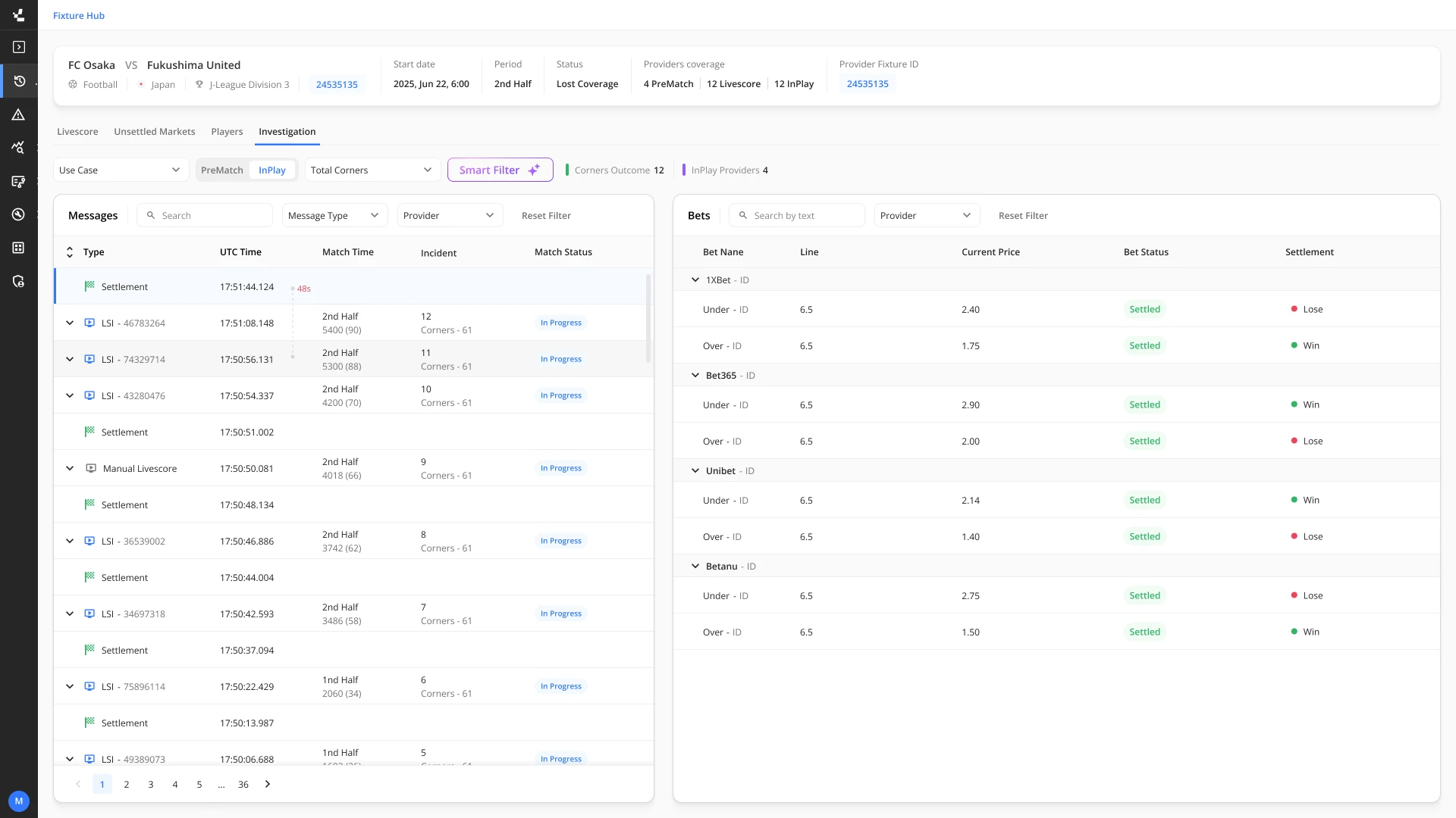
The History Viewer was created as the internal answer to this: a data triage and investigation tool designed to trace the full sequence of messages sent to clients and pinpoint exactly where along the pipeline an error occurred.
The core problem was that the product had grown organically as a "developer tool," accruing technical debt and zero UX infrastructure over time. It had become the operational backbone for multiple internal teams, yet continued to behave like a raw debugging console - extreme cognitive load, operational inefficiency, and prolonged investigation times were the norm.
Redesign from first principles while preserving the depth that power users - developers and QA engineers - depended on. The system needed to be radically more usable for time-pressured support specialists while remaining powerful enough for technical deep-dives.
The People Behind the Screens
Three distinct internal personas use the platform, each approaching data from a different analytical angle - and with very different time constraints.
Works under intense time pressure responding to client complaints. Needs a rapid understanding of the "match story" and sequence of events - but was historically overwhelmed by visual clutter and forced to rely on tedious manual search (Cmd+F) to locate the right data point.
Focused on root cause analysis, demanding instant access to raw JSON data and a customizable workspace. Struggled with a system that never persisted personal preferences and lacked any coherent timeline view for understanding the sequence of events.
Responsible for data integrity and system mappings. Performed highly repetitive, exhausting tasks due to complete context switching between the History Viewer and other daily workflow tools - a significant, ongoing drain on focus and productivity.
Core Challenges & UX Solutions
Each systemic problem was addressed with a targeted UX solution - restructuring the interface from first principles while preserving the depth power users needed.
Fragmented Interface & Cognitive Overload → Unified & Contextual Workspace
The legacy system was split into isolated, disconnected tabs (messages, bets, logs), preventing users from forming a quick situational overview. Furthermore, every filtering action triggered massive data loading times because the tables used infinite scroll without pagination or lazy loading.
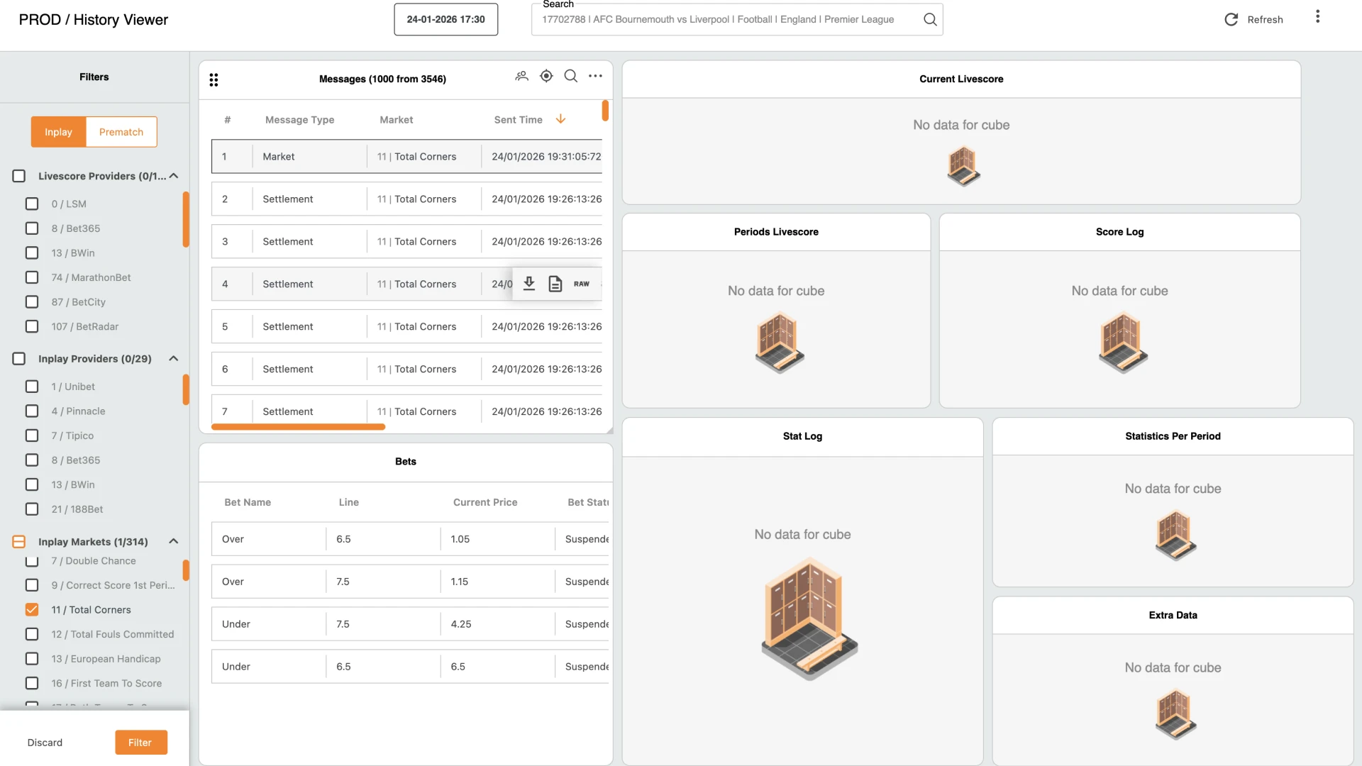
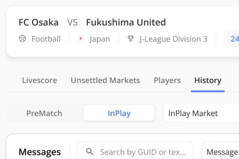
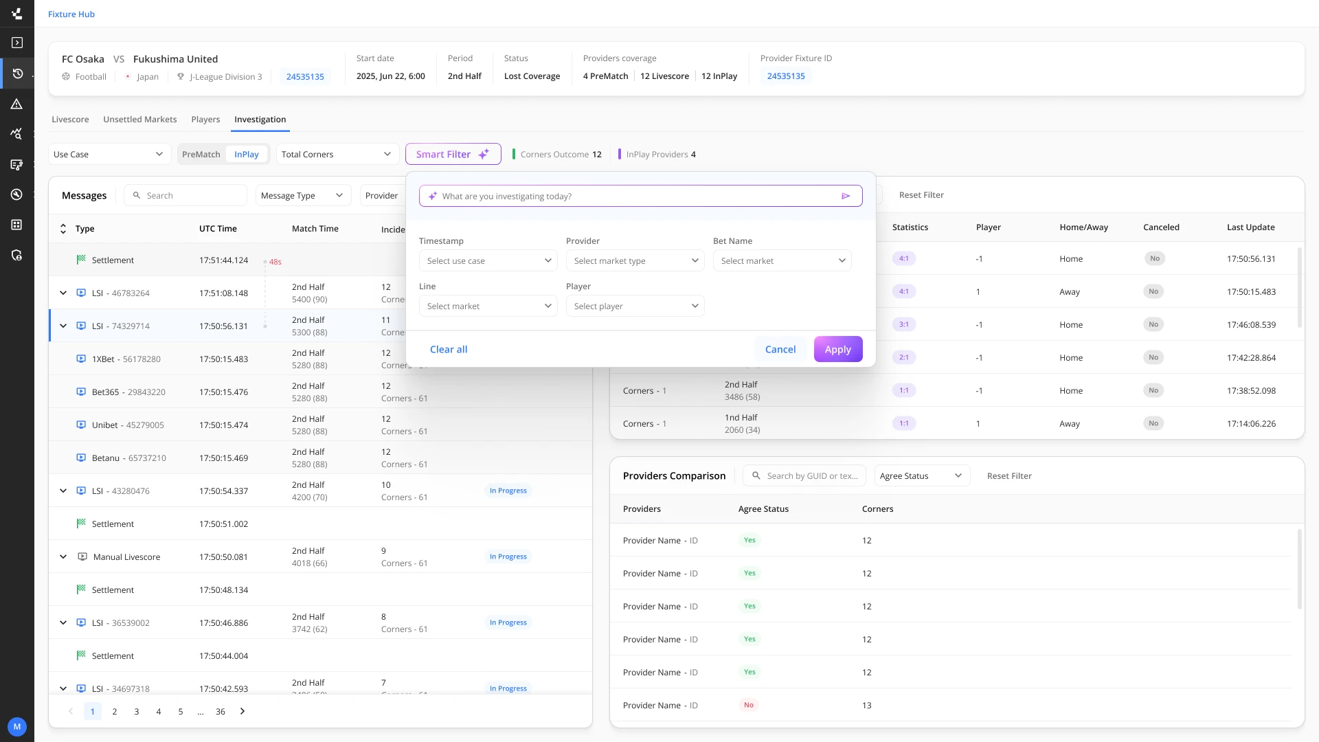
I designed a Unified Workspace that consolidates all system messages into a single central view. I implemented a dynamic Context Panel - clicking any message in the main list instantly opens its relevant details in the side panel, allowing the user to drill down without losing their place in the primary view. Additionally, I added smart contextual filtering that allows users to pre-select the specific betting market being investigated, filtering out background noise and radically reducing data load times.
Opaque Event Sequences → Chronological Timeline View
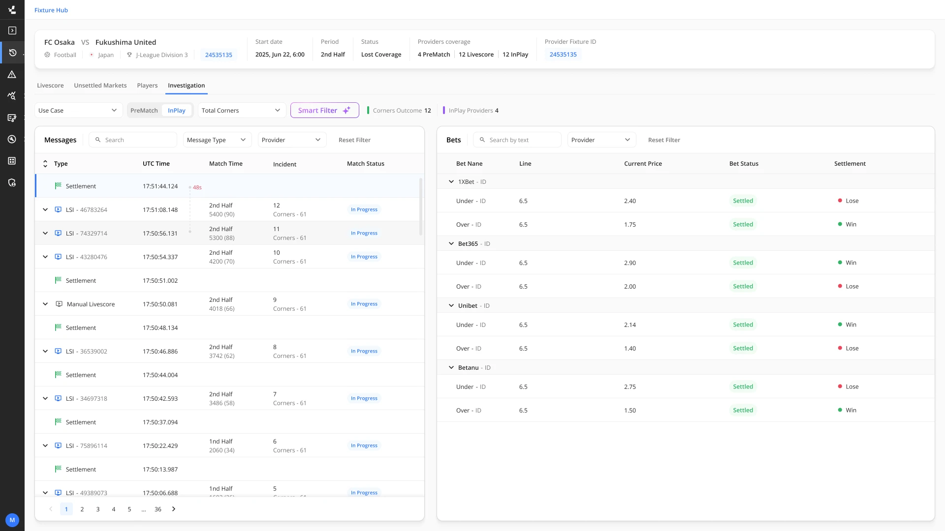
The chronological sequence of messages in the old system was counter-intuitive, making it difficult to understand the actual "story of the match." Finding critical metrics, such as transmission delays between receiving a livescore and finalizing a settlement, required users to dig manually through extensive JSON files.
I reorganized the message delivery stream into a visual, chronological Timeline View, presenting the flow of events naturally. I extracted critical data attributes (such as the Delay metric) directly from the raw JSON and surfaced them as accessible visual layers (Data Visualization) right on the interface, eliminating the need to read raw code.
Invisible Causality → Causality Mapping
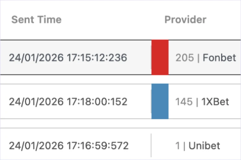
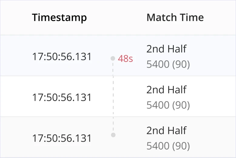
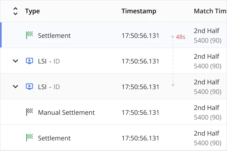
There was no visual connection between a Livescore message (the trigger, e.g., a goal scored) and a Settlement message (the outcome, e.g., closing the bet market). Users had to manually search and guess which event triggered the outcome.
I designed a smart visual indication that creates a direct link between the origin message and its subsequent outcome. Now, at a single glance, the user naturally understands the causality and instantly isolates the source of the error.
System Hopping → Seamless System Integration
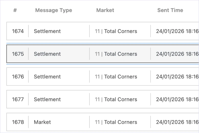
The tool operated as an isolated, external system. This forced users to hop between multiple separate internal administration systems during a single investigation, breaking their focus and draining operational time.
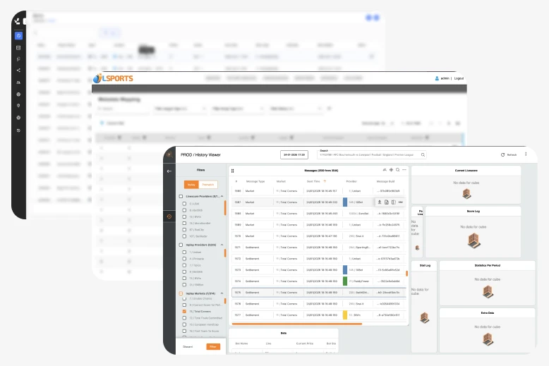
I spearheaded a system alignment initiative and integrated the History Viewer as a native module within the company's core platform. This established a single, coherent ecosystem where data flows fluidly without requiring external tabs or external tools.
Designing with AI
AI was leveraged at two distinct layers - inside the design process to improve research fidelity, and inside the product itself to eliminate operational friction.
When designing high-density, complex data systems, using generic dummy data (like Lorem Ipsum) severely limits usability testing insights. I leveraged AI tools to generate highly realistic, production-grade JSON datasets, including authentic sports events and team names. This allowed me to conduct exceptionally accurate Usability Testing sessions with real internal users directly inside Figma, identifying accessibility bottlenecks and visual clutter prior to engineering handover.
Previously, to locate a specific anomaly across thousands of data points, users had to painstakingly open messages one by one. To eliminate this operational friction, I conceptualized and designed a natural language Smart Filter component. Users can now type their intent in plain English, and the AI instantly translates the query into precise system parameters, delivering a clean, filtered data table in a fraction of a second.
Business Outcomes
Shifting the system from a fragmented developer tool to a user-centered operational platform yielded measurable results across all three user groups.
Average incident investigation times dropped significantly due to the Timeline View, Smart Filter, and Context Panel working in concert to surface the right information at the right moment.
Internal users reported a sharp decrease in operational fatigue and a higher capacity to make accurate, error-free decisions under time constraints - even during peak incident volumes.
Embedding the tool into the core platform entirely eliminated context switching, vastly improving the output and focus of internal support, QA, and content management teams.