Context
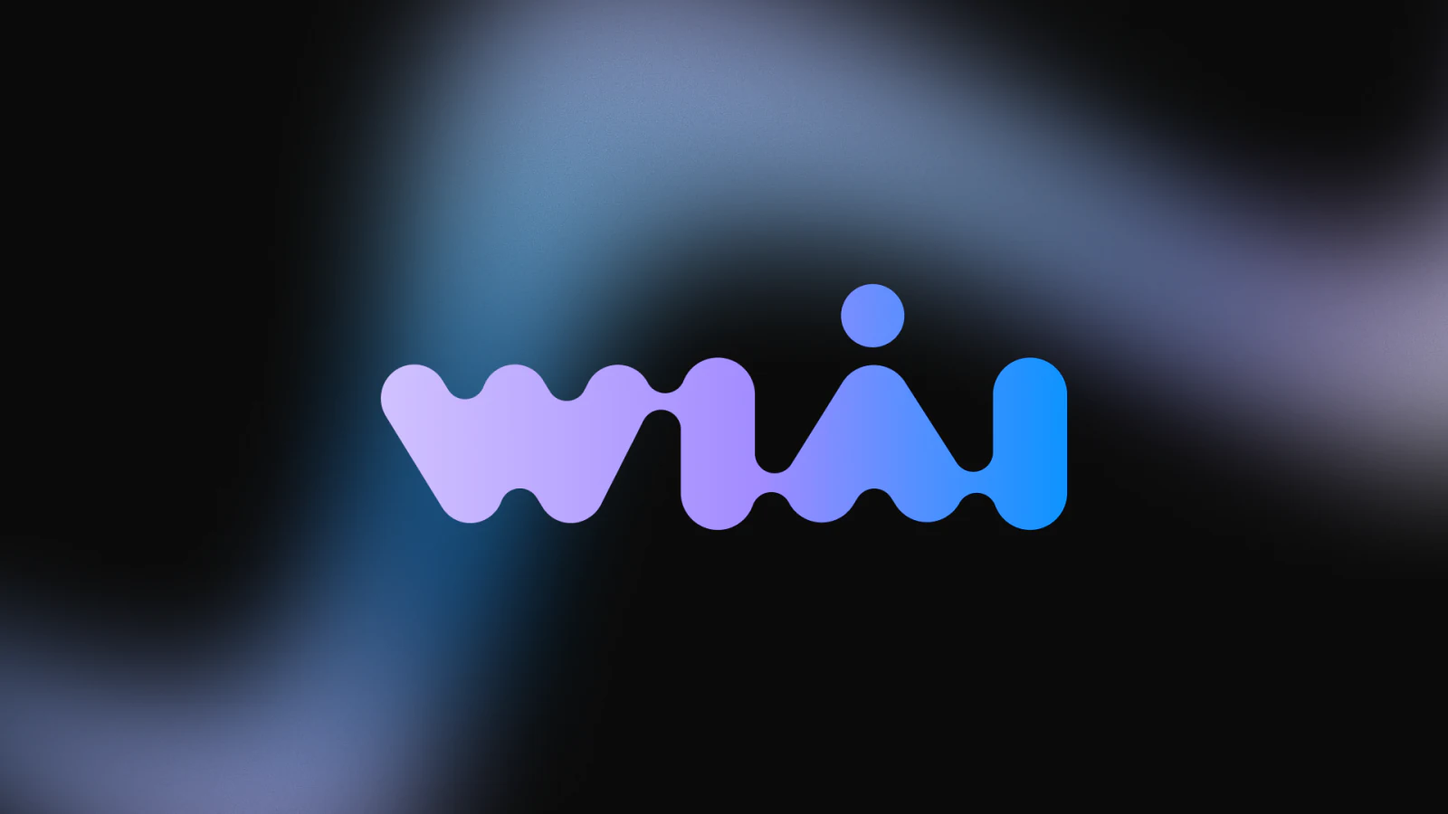
WiAI is a complete strategic redesign and rebranding of the WiDS (Women in Data Science) Israel community - transforming it into WiAI (Women in AI), a leading technological hub for women in development, research, and AI product management in Israel.
Completed within an intensive two-week design sprint, the project meant building a scalable visual language from the ground up, establishing a distinctive brand identity, and deploying a cohesive design system optimized for both digital touchpoints and real-world events.
Craft a dynamic identity that projects futuristic innovation and raw technical capability - without losing the core community values of inclusivity, belonging, and mutual support.
The Core Challenge
Two forces made a rebrand urgent: an identity that no longer stood out, and a community that had outgrown its own name.
Visual Identity Crisis
The community's legacy design lacked technical differentiation, leaning on generic “women-in-tech” cliches that blended in with dozens of other organizations.
Outgrowing the Brand
As the tech landscape rapidly evolved, the community expanded far beyond Data Science. With members pivoting into Machine Learning, Generative AI, and LLMs, the existing brand no longer reflected their cutting-edge professional reality.
Bridging Two Worlds
The strategy broadened the community's visual appeal for a highly diverse, technical audience. The language had to be technical enough to convey pure engineering professionalism, yet human enough to foster community and networking.
- Backend developers transitioning into AI
- Medical researchers & algorithm engineers from robotics
- Women leading AI Product Engineering
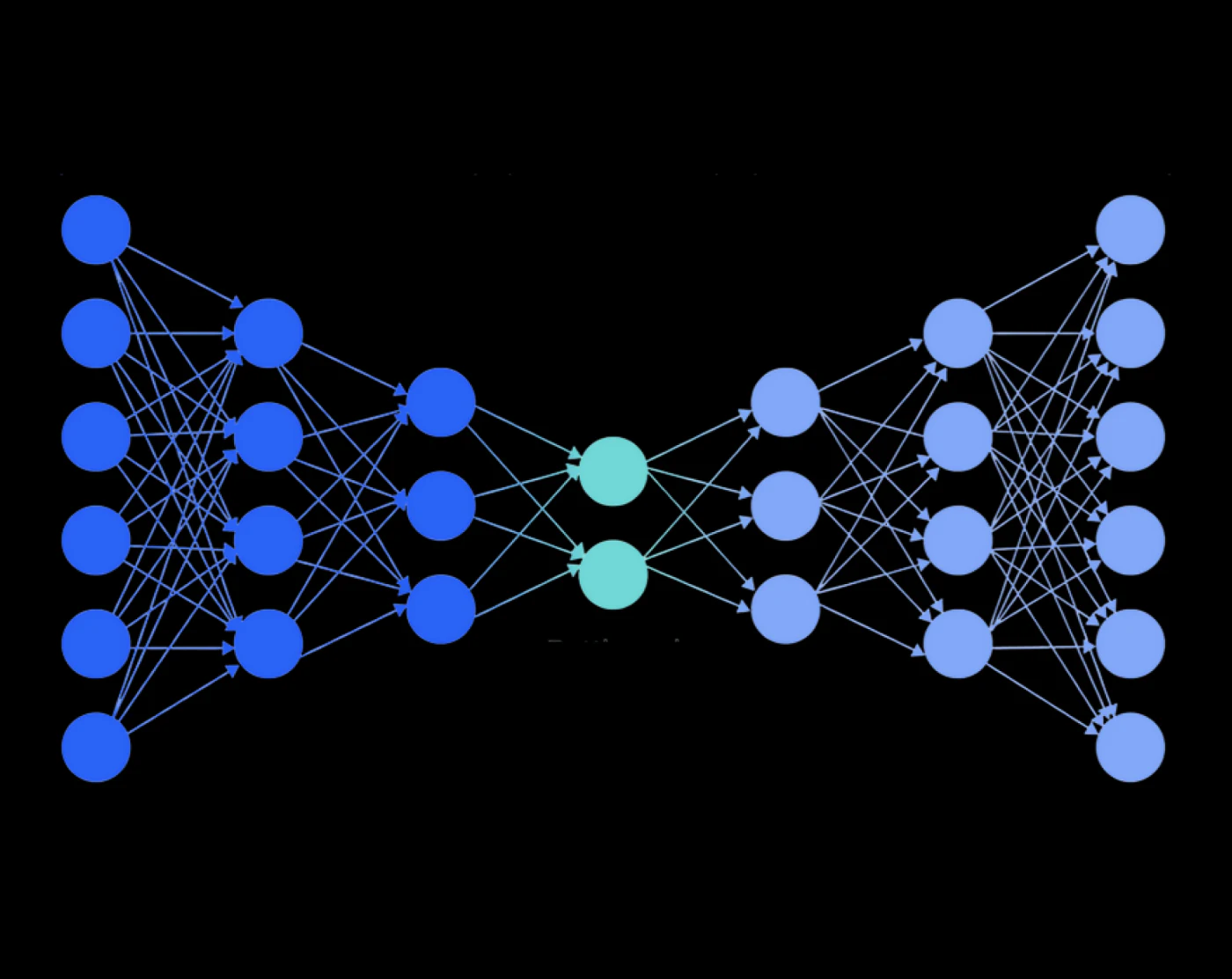
From Neural to Human Networks
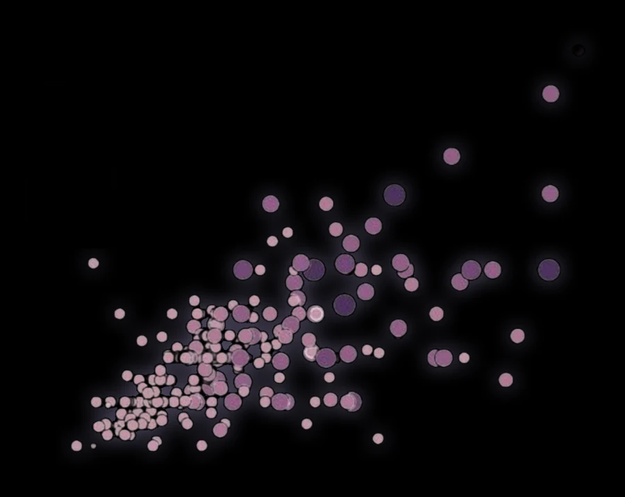
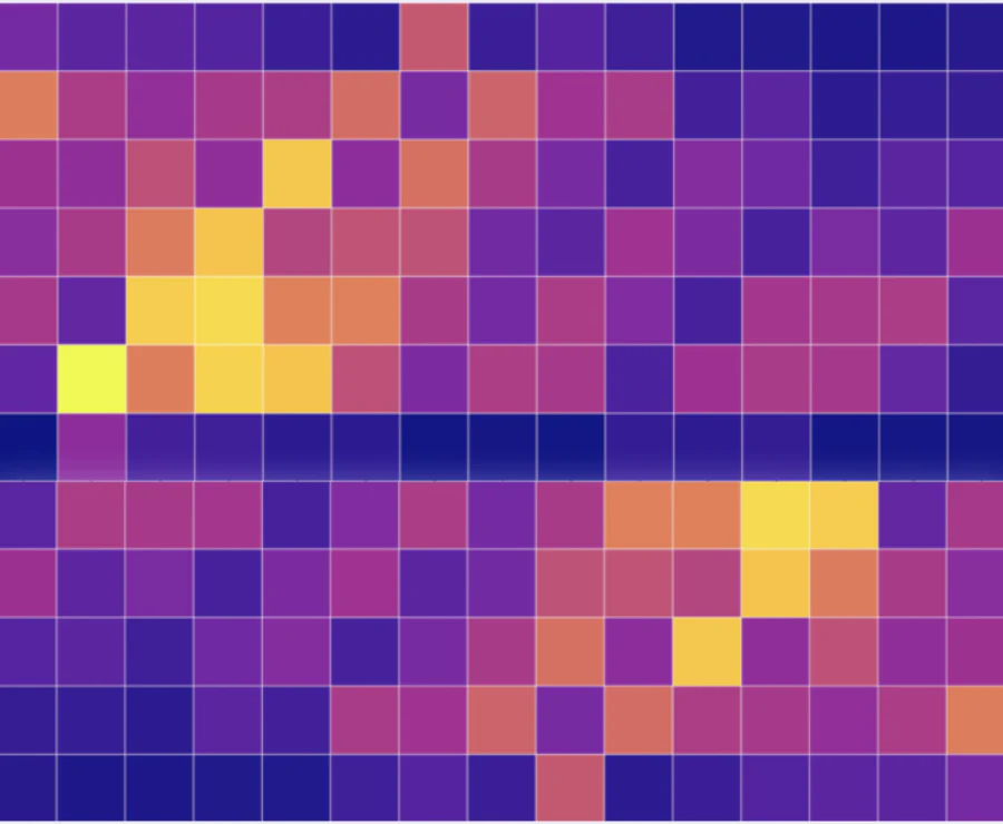
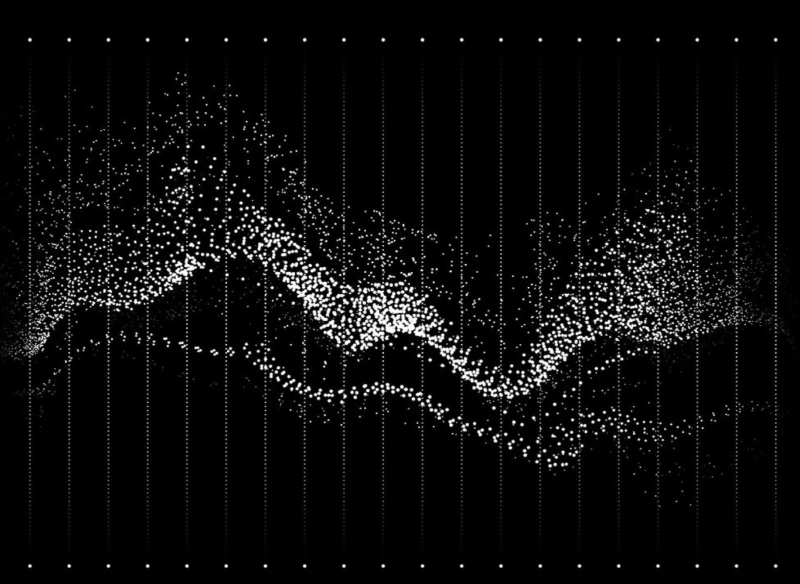
Visual research began in the deep technical realm - data nodes, heatmaps, and neural networks. The classic structure of AI relies on nodes and interconnecting lines transferring data. Rather than adopting the neural network as a cold, overused element, I gave it a human transformation through typography.
The Visual System
A scalable system built from a single idea: turn the network from a cold technical motif into a warm, human one.
The Typographic Logo
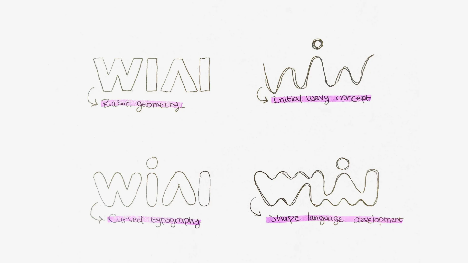
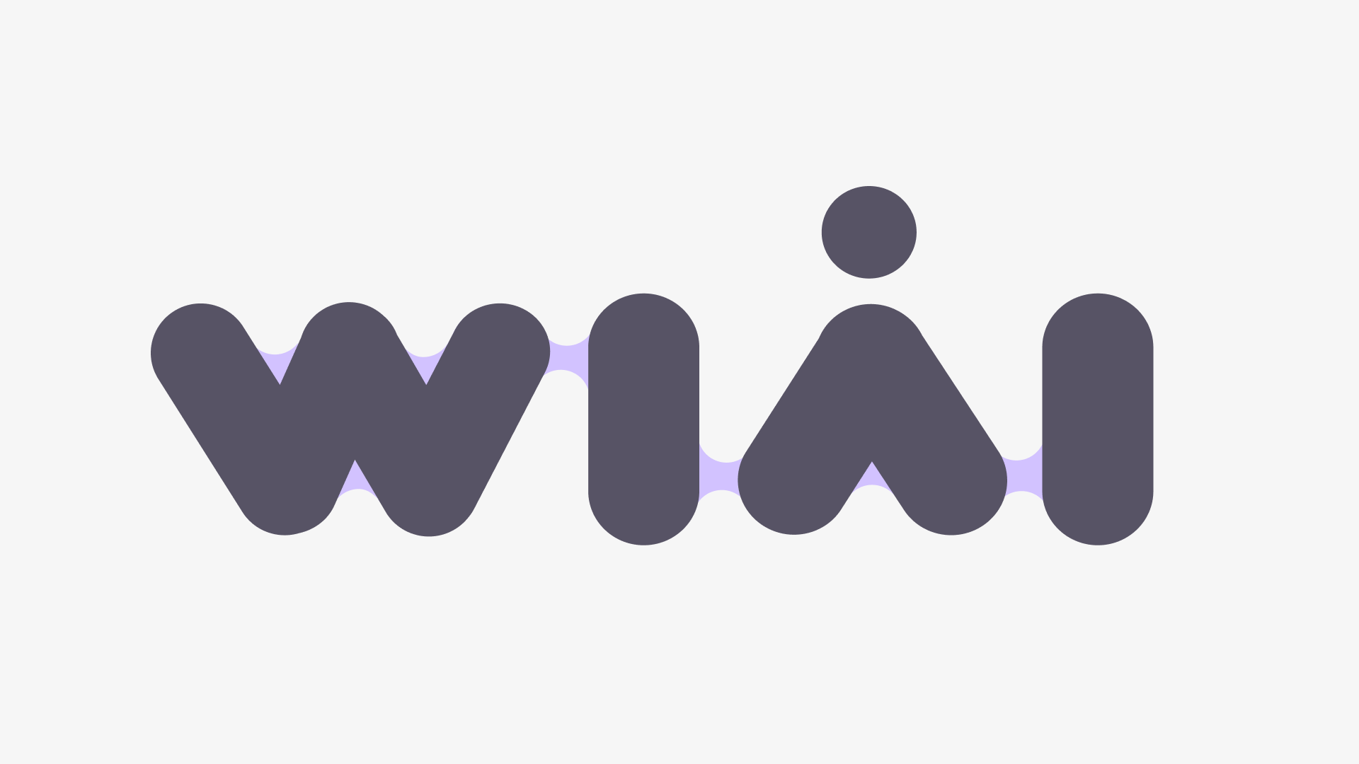
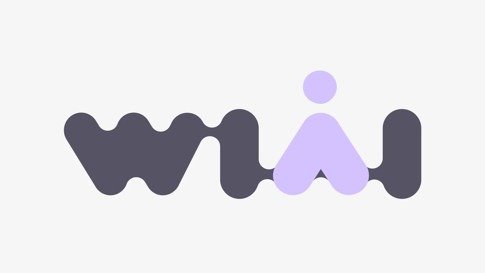
The connections in the WiAI logo are formed by linking the letters with fluid, rounded pathways. This visually simulates a data network while symbolizing the networking, mentorship, and mutual support among the women in the community.
The Hidden Silhouette
To subtly anchor the feminine identity within the technology, I integrated a visual “secret” into the typography. A single node placed precisely above the letter “A” creates a minimalist, geometric silhouette of a woman.
It is a quiet micro-interaction - a constant reminder that human women remain at the absolute center of this technology.
Dark Mode First & Color Palette
To organically align with the community's native working environments - IDEs, terminals, and leading AI interfaces like ChatGPT, Claude, and Gemini - the visual language was built with a strict Dark Mode First approach, using two colors for optimal contrast and emotional balance.
A sharp, vibrant blue that cuts through the dark UI - processing power, technological progress, and precision.
A gentle lilac that balances the blue - femininity, accessibility, and the human layer, elegant and non-cliche.
AI-Driven Execution & Generative Motion
To truly reflect the essence of an AI community, I integrated AI directly into the brand's production pipeline.
Instead of static, rendered video files for the community's digital presence, I used AI to generate code-based animations. By generating editable animation scripts, community managers now have dynamic, parametric assets that can be tweaked and scaled instantly to fit any video format or social template. This saved hours of manual keyframing and mirrored the community's core ethos: using AI as a practical, creative engineering tool.
Execution, Impact & Takeaways
The rollout required creating a complete, coherent ecosystem across every brand touchpoint.
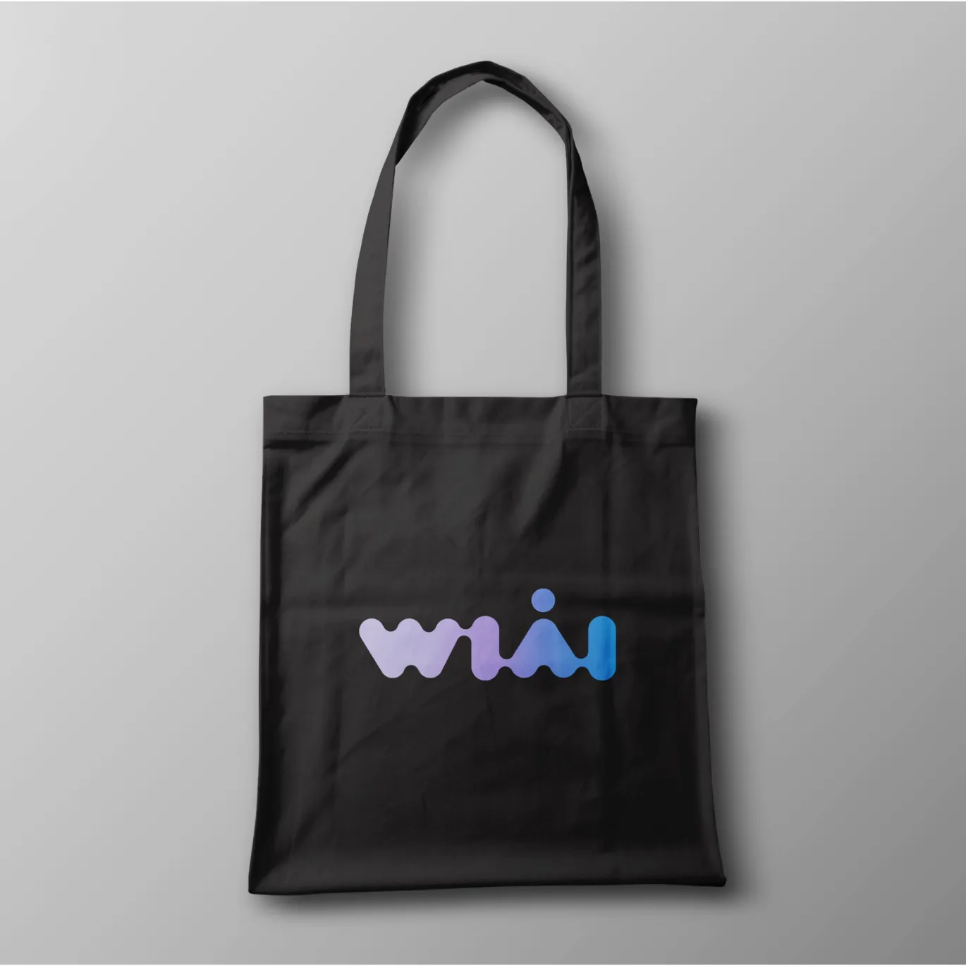
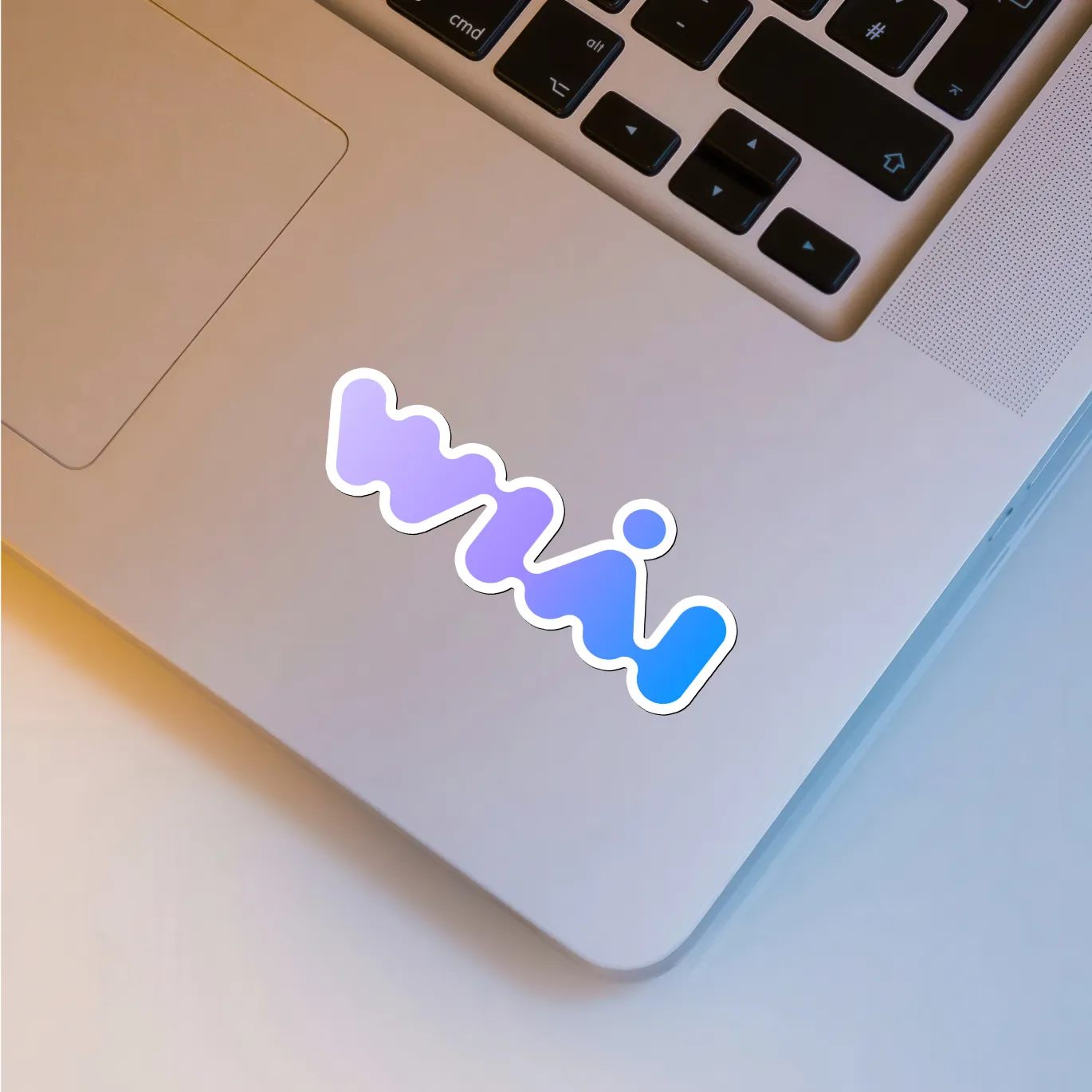
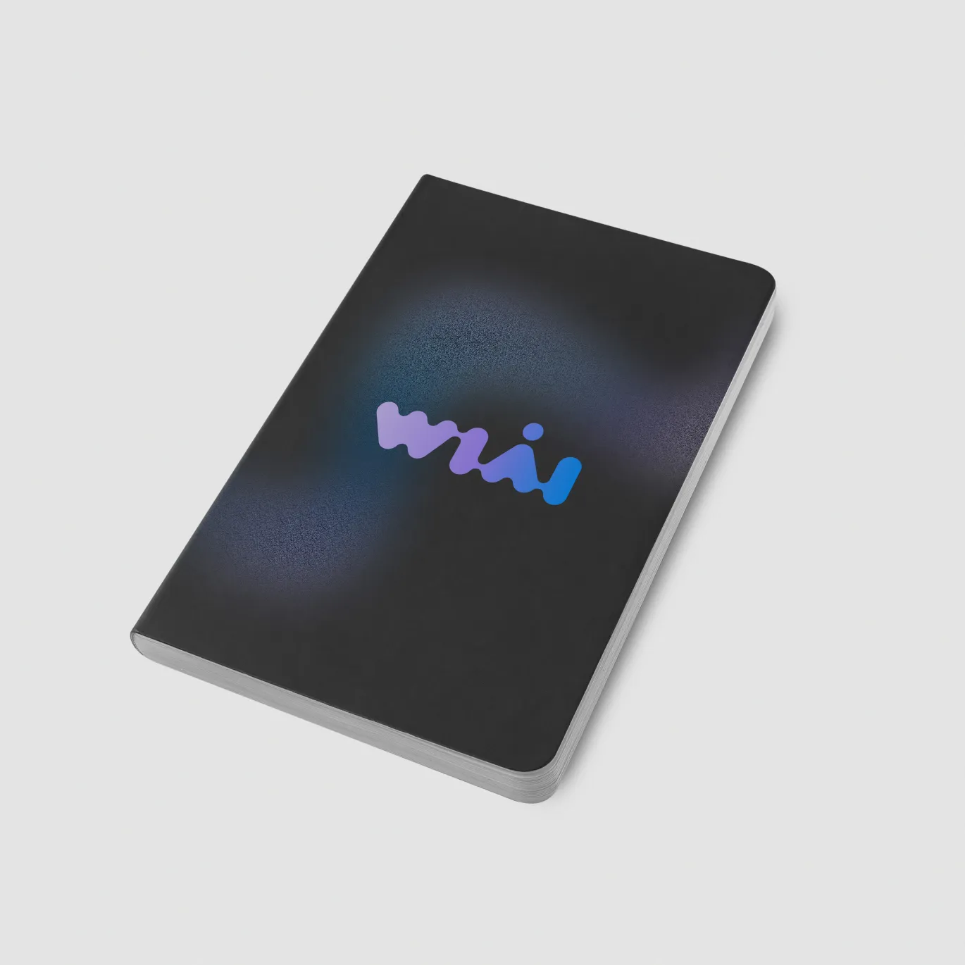
Physical Merchandise
Designing swag for tech conferences - stickers, totes, and notebooks that members actually want to carry.
Social Templates
Building an organized component library and defining global variables in Figma enabled a flexible, scalable template engine for social-media content.
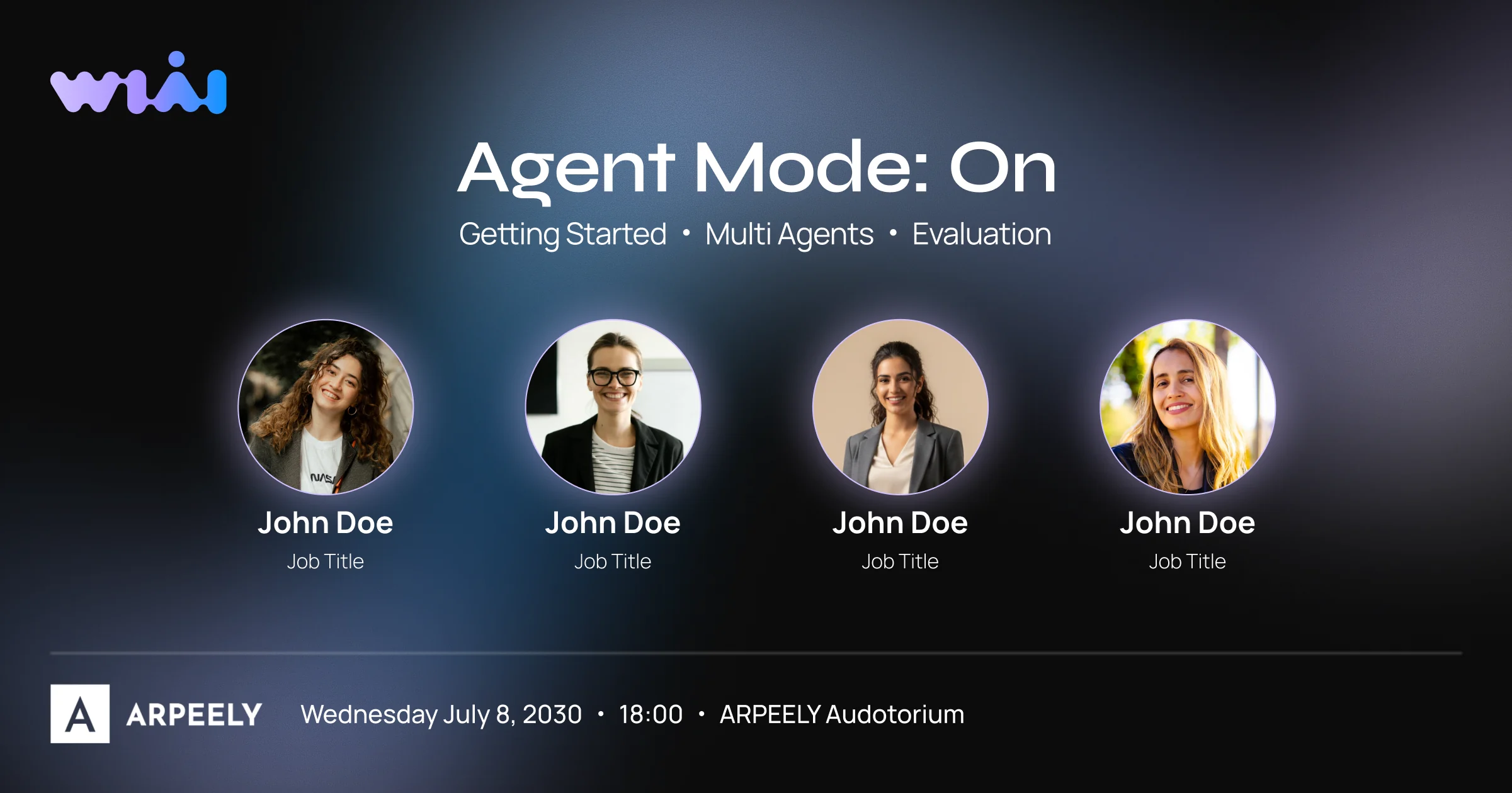
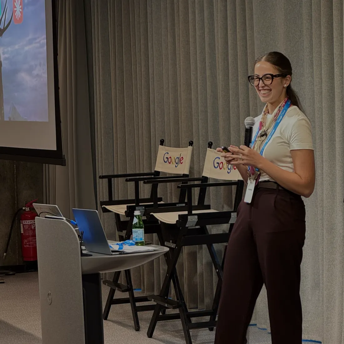
I had the privilege of personally presenting the new visual language and the rebranding journey on stage at a major community conference - repositioning WiAI as an advanced, inclusive, and powerful technological force in the local industry.
My key takeawayIn complex technical environments, design is not merely an aesthetic choice - it is a strategic tool for cultivating belonging, translating abstract concepts into human experiences, and building a true professional home.